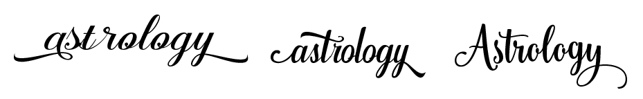
I'm looking at these logos again and the middle one looks like "castrology" bitch bye LOL https://i.gyazo.com/647e673f77613ae0350c3163629895a1.png
I'm hoping I picked the right one but I'm also making some graphics and feeling like I picked THE WRONG ONE. We'll see.
Yeah the second does look like it says that, I like the last one
i also really like the last one

I like the last one
LOL! It really does!!! I vote for the last one too
Yes, 3. In the first one the first 3 letters somehow are off the word...
and the t and r dont connect well at all.-
I like this font. 
( "Angelic Peace" )
Yeah I had a wrong glyph in there for the r when I took the pic lol
Also thx but no thx. That font's nice, but I'm not going for the whole 15 yr old edgy goth kid look lol. Been there done that with IMVU. Real noob mistake tbh
First one actually looks like this btw 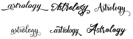
Yes, looks well balanced with the ... uh... swish to the left and right. 