Styling Plurk
Plurk can be styled with CSS. This basically means that any element on a Plurk profile can be customized. Colors can be changed, background can be altered etc.
The basic structure
There are three elements that are important to notice:
- body:
The element decides background of the page besides top bar, font size and text colors - #timeline_holder:
The element where the timeline is stored - #dashboard_holder:
The element where the dashboard is stored
Here is an example of how to create a very simple white theme:
/* USE_DARK_ICONS */
body {
    background: none;
    color: black;
}

#timeline_holder {
    background: none;
}

#top_bar a, #top_login a, #dashboard_holder a, #footer a {
    color: black !important;
}
USE_DARK_ICONS is a special comment that will make Plurk use darker icons.
Other than this, we recommend installing and exploring Plurk DOM via Firebug. It makes styling much easier.
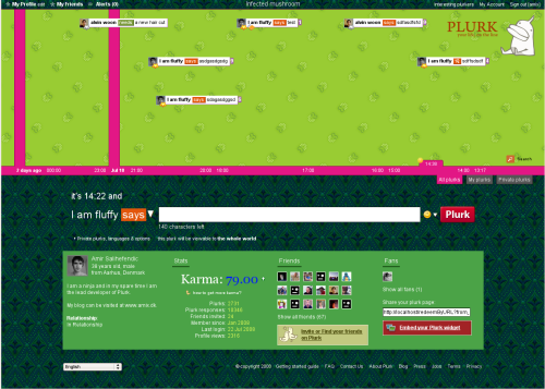
Example theme (Infected mushroom)
A greenish theme that uses backgrounds hosted on tinypic.com.

The code:
._lc_ {
    background-image: url(http://i37.tinypic.com/24fb3f6.gif);
    background-repeat: repeat;
    color: white;
}

#timeline_holder {
    background-image: url(http://i34.tinypic.com/6hs5d1.gif);
    background-repeat: repeat;
}

#top_bar a, #top_login a, #dashboard_holder a, #footer a {
    color: white;
}
Styling page title
You can paste in this code to pimp the profile title (red background with white text):
#page_title {
    background-color: #ff4e4e;
    padding: 1px;
    color: white;
}
Styling the dashboard
Paste in this code to make the dashboard red, with white text and a white border:
#plurk-dashboard {
    background-color: #ff4e4e;
    color: white;
    border: 2px solid white;
}
Resources
Learn CSS from these sites:
- CSS Beginner Tutorial: Introduction to CSS
- CSS tutorial: Learn the magic and tricks behind CSS in a complete tutorial
- Google search after CSS tricks: Search Google or other sites to learn some tricks
